Building Halcyon-7: The hoops I didn't expect
I've wanted to write more about the things I build and tinker with, so I figured I'd start with a project that gave me plenty to talk about.
Outside of the usual homelab and self-hosting rabbit holes, I've been building a small browser game called Halcyon-7. It started as an idea for a cozy online hangout inspired by games like Habbo Hotel and Club Penguin. You know the kind of games I mean: little characters walking around shared rooms, chatting with other players, collecting items and just spending time somewhere together.
The idea sounded simple enough. Build a few rooms, add some movement and chat, throw in a shop and a minigame, and call it a day.
Well, not quite.
Getting from that initial idea to something I could invite people to try involved quite a few detours. Some were technical problems, some were decisions I got wrong early on, and others were things I simply hadn't thought about until I started building them.
This post is about those detours, and a few things I learned along the way.

So, what is Halcyon-7?
Halcyon-7 is a small, browser-based 2D social hangout set on a retro space station.
You create a little character, walk around rooms, chat with other players, make friends, send private messages, collect badges and buy cosmetic items. There is also a small arcade minigame called Cargo Sort, where you redirect packages for a couple of minutes.
The current rooms include an arrivals hall, a cantina and a lounge. The idea is to make somewhere people can drop into without having to worry about daily streaks, constant progression or missing out on some limited-time reward.
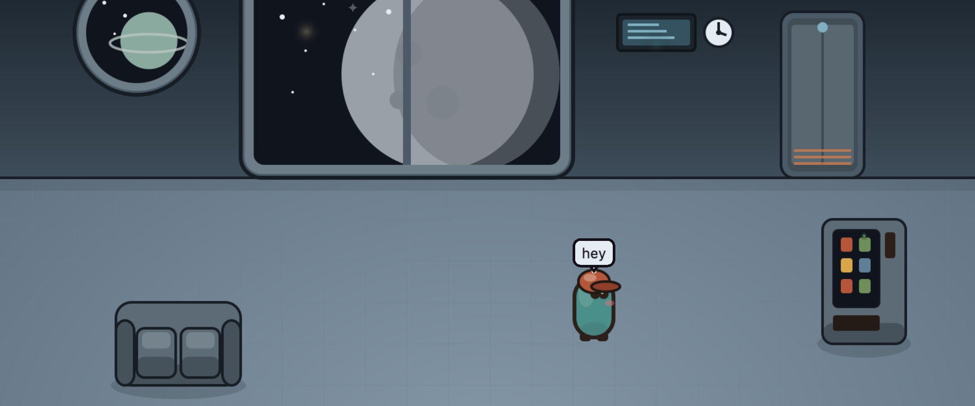
I wanted to capture the feeling of those older online hangouts without simply copying their worlds. A space station felt like a good fit, with warm lighting, dusty teal colours, terracotta accents and big windows looking out at planets.
It's a small project, built and run by me, with a friend helping out with the art along the way. It is desktop-only for now and is currently in a closed test.
The technical side is fairly typical for a modern web project, although there are a few moving parts. There's a web application for accounts and administration, a separate real-time server for movement and chat, PostgreSQL for persistent data, Redis for temporary state, and object storage for assets. Most of it is self-hosted, apart from authentication and email.
The more interesting part, though, isn't the stack itself. It's what happened when the original plans met the actual project.
1. My art direction changed three times
I originally planned to use low-resolution pixel art. Characters would be small, rooms would use a tile-based layout, and the whole thing would have a muted palette with a bit of a retro screen feel.
Then an artist friend became involved. His natural style was hand-drawn rather than pixel art, and I didn't want to force him into a style that wasn't his.
So the plan changed. Characters moved to a larger canvas, the asset dimensions changed, and I updated the rendering pipeline and documentation to match.
That was manageable. The next change was a little bigger.
Drawing every room, piece of furniture, prop, character and item by hand is quite a lot of work for one person with limited time. Even with help, it wasn't a great long-term approach for a project where I'd like to keep adding content.
I ended up building an SVG-based asset generator instead. Rather than drawing every asset individually, I could define them in code and generate the resulting images. That covered rooms, furniture, props, characters, icons and badges.
The results turned out well enough that we changed the way we approached the art. The generator became responsible for producing the main assets, and my friend could paint on top of them when something deserved a more personal touch.
This was probably one of the biggest improvements to the project. I stopped treating every new item as another drawing that needed to be made from scratch.
The lesson: the tools and pipeline need to fit the people and time you actually have. It's much better to adjust the process than to stick stubbornly to the original plan.
2. One hat could mean around 60 drawings
While working out the requirements for the character art, I realised how expensive a traditional sprite-based wardrobe could become.
Imagine adding a hat to the game. With the animation approach I originally had in mind, that hat would need to be drawn consistently across the character's different animations: walking in four directions, standing idle, sitting and performing emotes.
All together, that worked out to roughly 60 frames per item.
Now imagine launching with a dozen items, before even considering hair, shirts or anything else. Suddenly, what sounded like a small cosmetic feature involved hundreds of drawings.
I decided to limit the initial wardrobe to head items such as hats, glasses and masks. Hair and shirts weren't removed from the design entirely; the data model still supports those slots, so I wouldn't need to rebuild the underlying systems to bring them back.
At the time, that felt like a sensible compromise.
Then I started working on animation and discovered that the premise behind all those drawings was wrong in the first place.
The characters are round little shapes without limbs. There aren't any legs that need to move back and forth during a walking cycle. Drawing dozens of frames for something that doesn't have legs seemed a bit silly once I stopped to think about it.
So I changed the animation approach.
Instead of switching between lots of drawn frames, the game now uses transformations to make characters bob gently while walking, breathe while idle, and rock or bounce during emotes. Only a few states, such as sitting, sleeping and crying, need specially drawn variants.
And just like that, the problem of drawing 60 frames per hat disappeared. A hat became a single sprite attached to the character.
There's a nice lesson here about solving the right problem. I had already spent time documenting and planning an approach that I eventually didn't need.
The lesson: before investing in the details, make sure the underlying approach is actually the right one. Sometimes the best optimisation is to avoid creating all that work in the first place.
3. My minigame could be farmed without playing it
Cargo Sort is a small minigame played at an arcade cabinet inside the station. You redirect packages and earn a modest amount of in-game currency based on your play, with a guaranteed minimum reward and a bonus for completing your first game.
Sounds straightforward enough.
During testing, however, I found a rather silly exploit. A player could open the arcade cabinet, immediately close it, and still collect the minimum reward and the first-game bonus.
No packages sorted. No actual game played. Just free currency.
Naturally, this wasn't how it was supposed to work.
The fix was to make sure a game had to be meaningfully played before it could pay out. Simply opening and closing the cabinet was no longer enough.
It wasn't an especially complicated bug, but it was a good reminder that features don't always behave the way you imagine when you're the one designing them.
I'd tested whether the game worked. What I also needed to test was whether someone could get the reward without doing what the reward was meant for.
The lesson: when building anything with an economy, don't only test the intended behaviour. Spend some time trying to cheat your own system, because someone will eventually try.
4. My tests stopped proving what I thought they proved
One of the more subtle problems came from splitting the application into separate processes.
The web application and the real-time server have different responsibilities. For example, an administrator might mute a player through the web interface, while that player is connected to the real-time server.
The moderation action needs to reach the correct process, even though it isn't necessarily the process that received the original request. A messaging layer handles that communication.
The architecture made sense, but it also changed how I needed to test the game.
Before this, opening a couple of browser tabs and clicking around was enough to catch quite a few problems. Once multiple processes were involved, that kind of manual testing could give me a false sense of security.
Everything might appear to work when the relevant code happened to be running together, while communication between separate processes was still broken.
The solution was to build tests around actual multi-process scenarios. Instead of just checking that the usual actions worked, I needed to check that messages reached the right places and that things behaved correctly when they didn't.
This is not the sort of problem that looks impressive in a feature list, but it's the kind of detail that matters when people start using the system for real.
5. The game worked, but it looked like a wireframe
For quite a while, the priority was functionality. I wanted accounts, chat, friends, private messages, profiles, badges, the shop, the minigame and moderation to work before spending too much time on the visual design.
That approach did its job. Eventually, I reached the point where the main features were there, and the MVP was functionally complete.
Then I actually looked at it.
The chat panel was mostly a wall of unstyled text. Profiles were just stacks of information. The interface worked, but it didn't feel like a space station at all.
I'd effectively built the systems and left the visual experience for later. And later turned out to mean a whole dedicated phase of work.
I wrote a design document for the overhaul, established a colour palette based on the room art, picked fonts, defined spacing and motion rules, and worked through the individual screens.
I also wanted the in-game interface to feel different from the more practical parts of the website.
The shop, chat and profile cards have softer backgrounds and warmer borders, so they feel like they belong in the game world. Administration tools and legal pages stay much plainer. There's no need for a moderation dashboard to look like a sci-fi prop.
It took longer than I'd originally accounted for, but it made a huge difference.
The lesson: leaving the design until later can be a perfectly reasonable choice, especially for a small project. But it isn't free. Visual polish is work, and it should be part of the plan from the beginning.
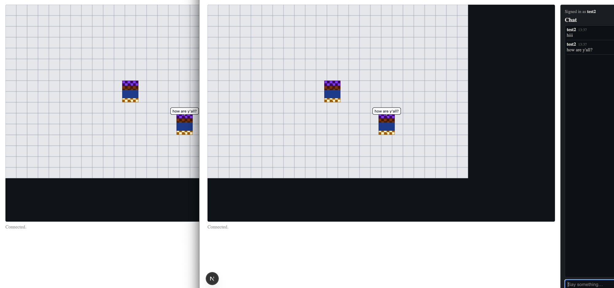
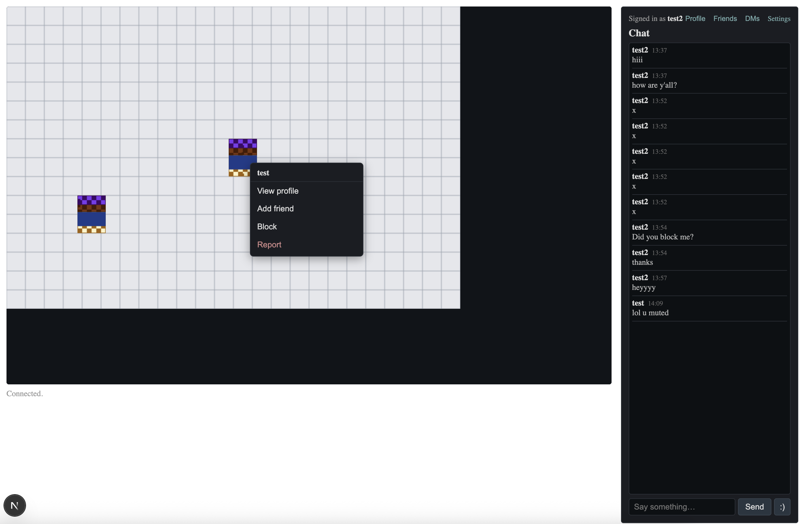
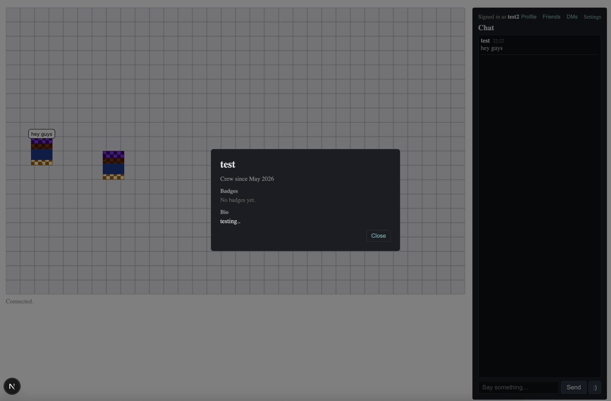
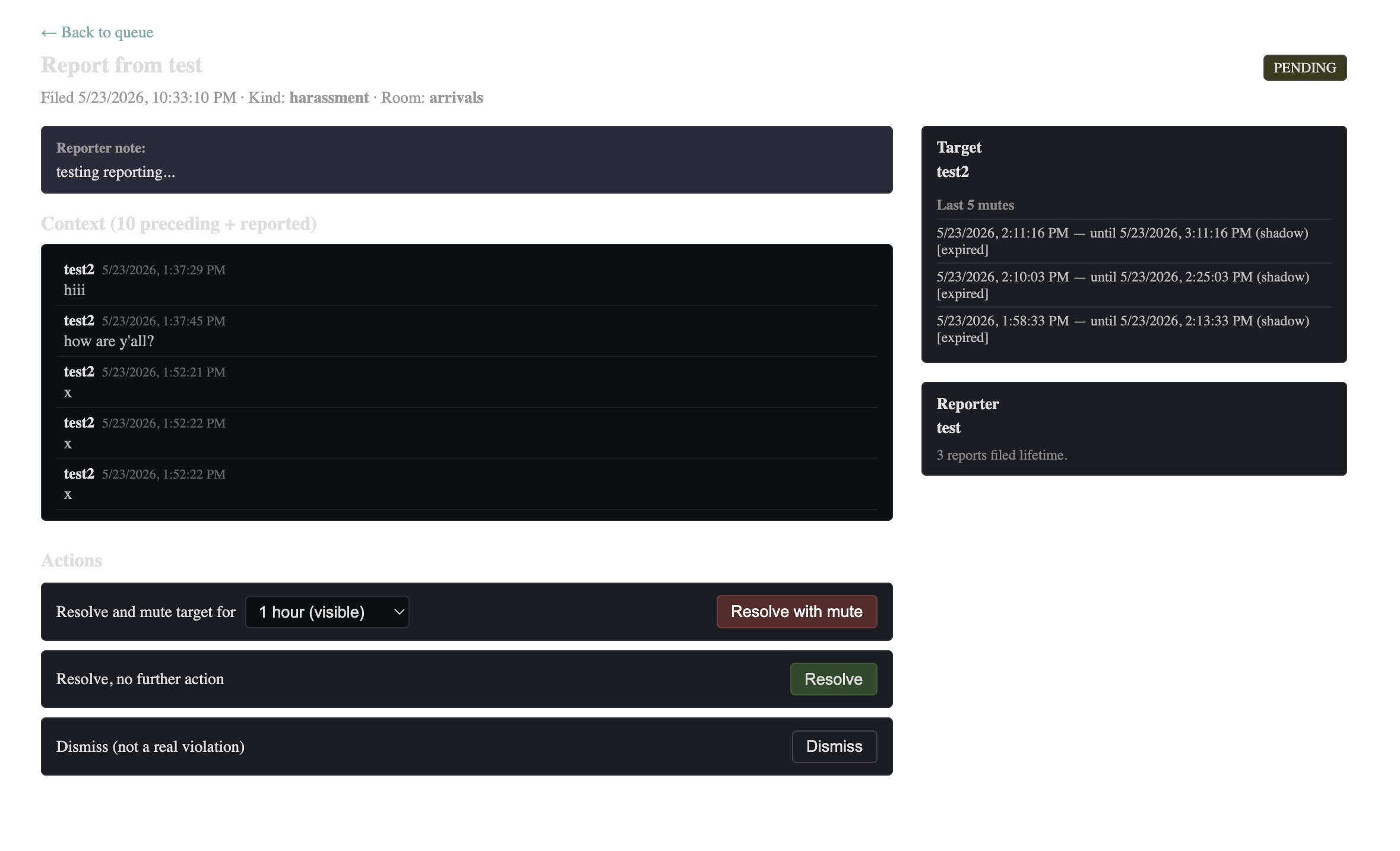
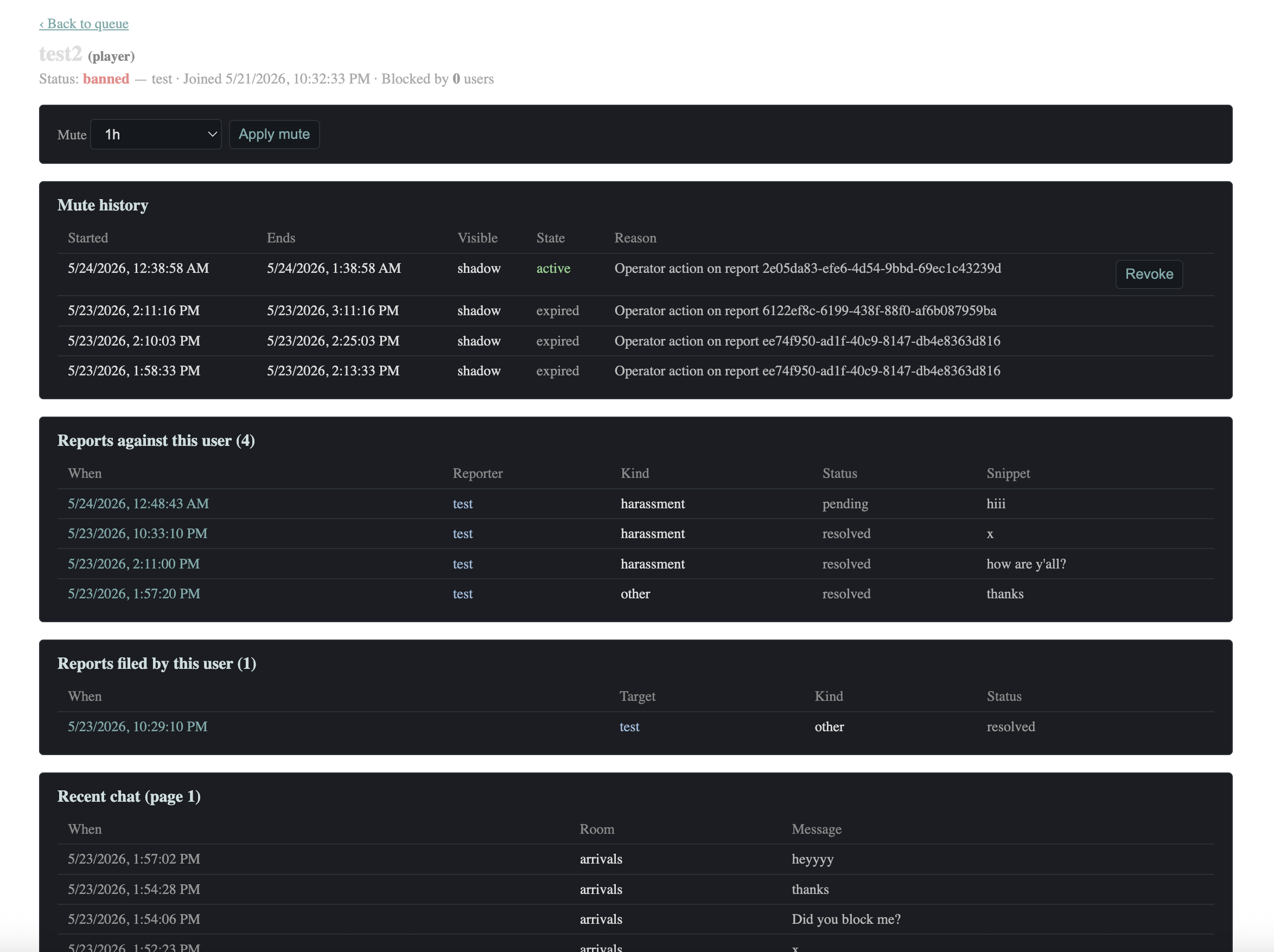
pre visual polish screenshots (engine & admin tools)
6. The rooms were too small, and changing the tile size would have been a mess
After the interface overhaul, another problem became obvious. The rooms themselves felt too small.
The game was displaying rooms at their original size in a fixed canvas, leaving a lot of unused space around them. The characters looked tiny, and the whole thing felt less like a place you could spend time in and more like a small scene sitting inside a large empty frame.
My first instinct was to make the tile grid bigger.
Fortunately, I'd already made an important architectural decision much earlier: the server understands the world in terms of tiles, while the renderer is responsible for turning those world coordinates into pixels on the screen.
That separation meant I didn't actually need to change the tile size at all.
Changing it would have affected the room files, content pipeline, collision detection and pathfinding. It could easily have turned into a much bigger migration.
Instead, I changed the renderer so that the entire room scales to fit the available space. The display frame adapts to the room's shape, and characters and chat bubbles remain visible.
The game logic didn't need to change.
This was one of those moments where a decision made months earlier paid off. At the time, separating world coordinates from screen pixels might have seemed like an implementation detail. Later, it allowed me to fix a visible problem without having to touch half the project.
The lesson: good architecture isn't necessarily about predicting every future problem. Sometimes it's just about making sure that when a problem appears, you have a sensible place to fix it.
7. Clicking twice could teleport your character
Sometimes the strangest bugs show up in the simplest features.
During manual testing, I found a problem with movement. I'd click a tile to send my character somewhere, then click another tile before the character had finished walking.
Instead of smoothly changing direction, the character would teleport to the first destination and then continue towards the second.
Not exactly the movement experience I was going for.
The tricky part was that movement involves more than just drawing a character in a different position. The client handles the visual animation, while the server is responsible for things such as path planning and the actual movement rules. The fix needed to happen at the right layer, rather than simply hiding the symptom on the screen.
It also needed to look correct to other players watching the same character move, not just to the person controlling it.
The issue was fixed separately from the usual development phases, after diagnosing where the problem belonged.
The funny thing is that the bug wasn't triggered by an especially complicated action. I simply clicked twice.
Somehow, testing the ordinary things people do when they're impatient is easy to overlook when you're focused on building the bigger systems.
8. My documentation slowly stopped describing the real project
I put quite a lot of effort into documenting Halcyon-7. Major features had written designs, significant technical decisions were recorded, and each development phase had a plan before the code was written.
By the animation phase, I'd accumulated 21 architecture decision records covering things such as character dimensions, the coordinate system, room scaling and animation.
The intention was to make decisions explicit rather than leave them scattered across my memory and the codebase.
But documentation has its own maintenance problem: it can quietly become wrong.
Over time, a few things drifted. Some documents referenced a decision record that didn't exist as a file. The architecture documentation described things that weren't actually present in the code. A comment claimed that a privacy case was handled when it wasn't. Even a walking-speed value in the animation plan was wrong.
None of these things necessarily broke the game immediately. That's what makes this type of problem dangerous.
A document can be mostly correct and still mislead you at exactly the moment you need to trust it. The same goes for comments in code.
I eventually did a dedicated cleanup pass, checking claims against the actual code and Git history and correcting whichever side was wrong.
I also ran a broader audit before inviting testers. It covered security, dependencies, performance and documentation. The audit itself was read-only: it produced findings first, and I handled the fixes afterwards in separate, reviewable changes.
The overall result was reassuring. The core design was in good shape, but the audit still found several real problems. There were places where moderation records weren't guaranteed to be saved correctly, some privacy behaviour didn't match what the documentation claimed, a visual cue related to blocking could stop working as intended, and stored history had no proper retention policy.
Most of these issues were fixed before the closed test. The data-retention policy still needed a deliberate decision, rather than a quick patch.
I think the important part was separating finding problems from fixing them. It would have been tempting to let a tool make a large batch of changes and call it done, but that would have made it much harder to understand and trust the results. Reviewing smaller changes one at a time worked much better.
The lesson: documentation needs maintenance just like code does. And when an audit finds problems, the goal isn't simply to make them disappear from a report. You need to understand what changed and verify that the fix actually solves the issue.
So, was all this planning worth it?
Looking back, quite a few of these problems were avoidable. I could have settled the art pipeline earlier, planned for a proper design phase from the start, or checked the documentation more regularly.
But I also think some of the detours show why the planning was useful in the first place.
When I changed the art direction, the engine didn't need to be rewritten because it depended on asset dimensions and anchor points rather than a particular art style. When the rooms needed to scale differently, an earlier decision made that change relatively straightforward. And when the animation approach changed, working it out before implementing it saved me from building a system around assumptions that no longer made sense.
Not every decision turned out to be right. The point was that I could revisit them, understand why they were made, and change course without losing track of the rest of the project.
I also tried to keep development in small steps. Each phase had a plan, and changes were made one commit at a time, with reviews along the way. It sometimes felt slower than simply charging ahead, but it made individual changes easier to understand and undo when necessary.
I used AI tools as part of this process, too: one helped with planning and reviewing designs, while a coding agent handled implementation in small steps. I still had to make the decisions, check the results and decide whether the code matched what I actually wanted. The tools helped with the workload, but they didn't remove the need to understand the project.
For a solo side project, that balance mattered quite a bit.
Where things stand now
Halcyon-7 is currently in a closed test. There's still work to do, but the core experience is in place, and I'm at the point where feedback from actual players matters more than adding another layer of technical polish in isolation.
The next ideas are fairly modest: more rooms, seasonal decorations for the station, and eventually some more content to give people a reason to explore. I also need to settle the remaining data-retention policy.
I don't want this to become a game that constantly demands attention. I'd rather have a few good rooms that feel nice to hang out in than a mountain of features designed to keep people clicking.
And that probably sums up how I want to approach the project in general. Build something small, make sensible decisions, and improve it when there's a good reason to do so.
The hoops along the way weren't all signs of bad planning. Sometimes they were the result of a plan doing exactly what it was supposed to do: making a change easier, catching an awkward assumption early, or giving me somewhere to look when something went wrong.
I'll probably write a follow-up about the things that worked well, what I'd do differently from the beginning, and some of the technical decisions that deserve a closer look.
For now, I'm happy that Halcyon-7 has made it this far. The next interesting part is seeing how it holds up when other people start spending time in it.
Will report more on Halcyon and its infrastructure...
Cheers.
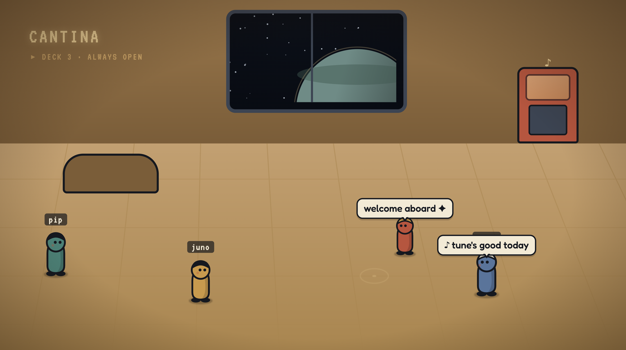

Halcyon-7 will open for public testing soon. Promise.